Casual Weekend Looks That Mix Bold Prints and Colors

Why Bold Prints and Colors Work for Weekends
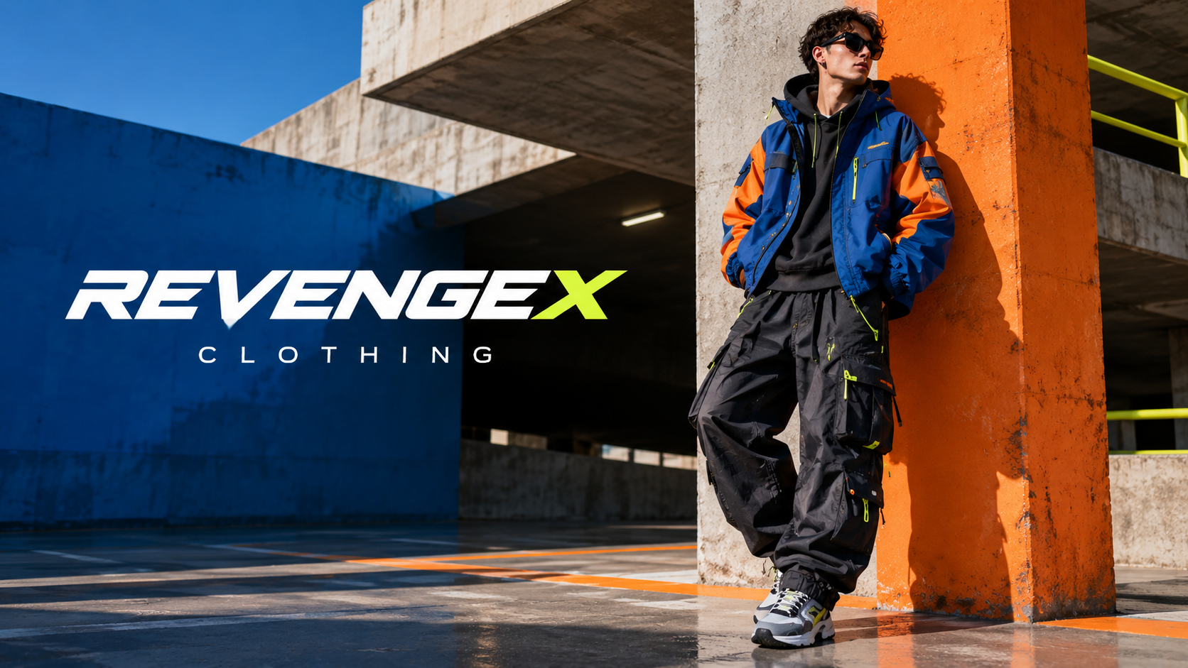
Bold prints and colors belong on the weekend because that is when clothes get to be fun instead of safe. Nobody is grading you on a client call or a boardroom look, so a striped shirt under a floral jacket or a bright orange tee next to a graphic print skirt can just be enjoyable. The trick is treating color and pattern like ingredients rather than accidents. One loud element usually reads as a statement, but two loud elements can read as confidence if you give them room. Start by picking one piece you already love, maybe a patterned shirt or colorful pants, and build around it instead of trying to match everything at once. If you want a starting point for pieces with strong graphics and saturated color, a shop like revengex sells clothing that leans into exactly that kind of print-forward, color-heavy wardrobe. The goal on a weekend is ease, not a costume, so keep the rest of the outfit simple while the standout piece does its job. A plain cap, worn sneakers, and nothing else competing for attention usually does the trick.
Key takeaways
- Pick one standout patterned or colorful piece and keep the rest of the outfit simple to let it shine.
- Mix prints by scale and shared color so they feel connected instead of competing.
- Use neutral shoes, bags or jackets to balance loud color pairings and keep an outfit looking finished.
Pairing Two Prints Without Looking Chaotic
Mixing two prints sounds risky until you realize it mostly comes down to scale. A small, tight pattern like a fine stripe or a micro check sits comfortably next to a larger, looser print like a big floral or an abstract graphic, because your eye reads them as different sizes rather than competing noise. Trouble starts when both prints are roughly the same scale and fight for the same visual space. Color also helps here: if both prints share one common color, even a small amount, they tend to feel connected instead of random. A striped shirt with navy and white pairs naturally with a floral short that has a touch of navy in it, for instance. Texture matters too. A smooth cotton print against a slightly textured knit print keeps things from blurring together. If you are nervous about trying this for the first time, test it with accessories before committing to two full garments: a patterned bandana or socks next to a printed shirt is a low-stakes way to practice. Weekend dressing forgives experiments that work-week dressing never would, so use that freedom while you have it.
Building Color Combinations That Feel Intentional
Color pairing gets easier once you stop thinking in terms of matching and start thinking in terms of contrast and balance. Warm colors like orange, red and yellow tend to pop against cool backgrounds like denim blue or forest green, which is why a bright top with plain jeans almost always works. If you want to wear two strong colors together, like fuchsia and cobalt, try using one as the dominant piece and the other as a smaller accent, maybe a bag or a pair of shoes, rather than splitting them fifty-fifty across the outfit. Neutral colors such as white, black, beige and gray are not boring here, they are tools. A neutral jacket or sneaker calms down a loud color pairing without dulling it. Pattern and solid color can combine the same way: a colorful graphic tee under a solid-colored overshirt lets the print show through a collar or open front while the jacket keeps the overall look controlled. Anyone shopping for pieces to build this kind of wardrobe might look at what revenge x style shops carry, since brands focused on graphic and colorful basics, including revenge x, give you a wider pool of color-saturated pieces to mix and match on a free Saturday.
Shoes, Accessories and Finishing a Print-Heavy Outfit
Footwear and accessories decide whether a bold outfit looks finished or just busy. When the top half carries a loud print, simple sneakers in a single neutral color let the eye rest. When the outfit is mostly solid color with one patterned accessory, like a scarf or a cap, you can afford slightly louder shoes, maybe a two-tone sneaker or a colorful slide. Jewelry works best kept minimal around bold prints and colors, since small, simple pieces will not compete with what is already happening on the fabric. A crossbody bag or tote in a solid shade pulls focus back to the outfit instead of adding another pattern to track. Sunglasses are an easy finishing touch that also quietly tie a color scheme together if the frame picks up one shade already present in the clothing. Weather matters for weekend plans too: a lightweight jacket in a solid color thrown over a printed outfit gives you flexibility without burying the print entirely. The overall aim is a look that feels deliberate rather than overloaded, where every piece earns its spot instead of just adding more noise to an already loud outfit.
Frequently asked questions
How do you mix two prints without it looking too busy?
Pair prints of different scales, like a small stripe with a larger floral, and look for a shared color between them. This gives your eye a resting point and keeps the combination from feeling random.
What colors pair well with bold prints for a casual look?
Neutral colors such as white, black, beige and gray work best as a base because they calm down a loud print. Warm accent colors like orange or red can also work if kept to one smaller piece rather than spread across the whole outfit.
Are bold prints and colors appropriate for everyday casual wear?
Yes, weekends and casual settings are the easiest place to experiment since there is less pressure for a polished, uniform look. Starting small with accessories or one standout piece makes the transition comfortable.